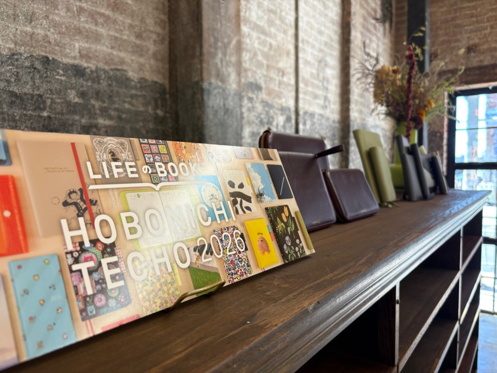
Hi all! It’s that time of year when I share some of my random, highly subjective observations from the Hobonichi preview event. Would love to know what you think, in the Hobonichi Techo Users Facebook group or on Instagram @ gemcha0s!
- Two things I’ve come to look forward to that were notably missing this year, are more paper series options and HONs with the rougher hard cover texture (such as the Unsodo and Tomitaro Makino HONs). The Black Gingham is still around, which is great, but no other special paper covers. I’m a big texture person so I’m sad not to have options like that this year.

- Speaking of texture, the Tolight cover which was medium pretty in photos (to me) was a delightful woven textire. The weave is really beautiful, especially in contrast to the glossy flowers printed on top. Not my cover, but if you were thinking of that one I think it won’t disappoint.

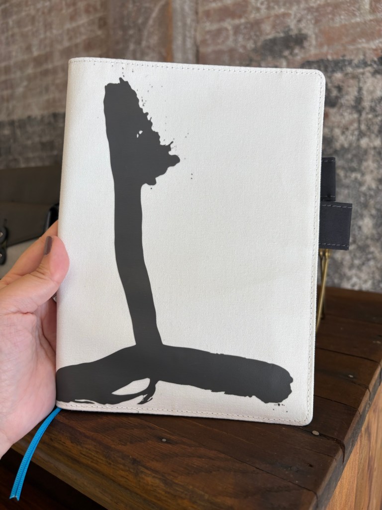
- My favorite HON design this year was Waiting on the Chord by Hiroko Kubota—I come from a musical family and played the violin—but I really did not like the smoothe, matte plastic-y paper used for that cover. The biggest disruption for me today was realizing I might dislike that texture enough to not get the cover. I also tried my clear plastic HON cover in cover on it, and it didn’t look good because it dulled the colors.
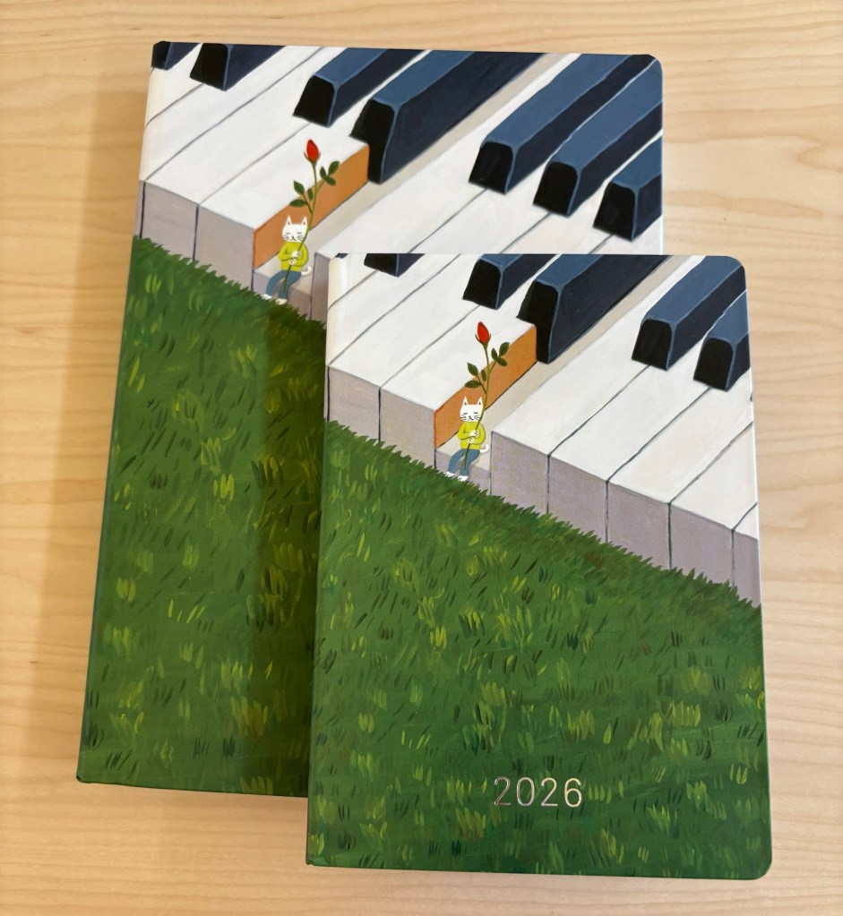
- Speaking of Hiroko Kubota that 5Y design brings me so much joy.
- Moomin was not at the preview event. I asked about it and they weren’t 100% sure but said it might be a Japan exclusive (this is not, however, marked on the site). I am realizing in retrospect Tomie wasn’t there either, didn’t get a chance to ask why. Might be Hononichi store exclusives but still buyable.
- The new sage green leather cover is very soft and buttery smooth, if you like that.
- The Mina Skyful and Aalto covers are both very vibrant and beautiful in person, and the Skyful in particular has a wonderful embroidered texture. The interior yellow is a VERY bright lemony yellow—I personally love that shade of yellow. Although a note of warning if it matters: it’s very summery.

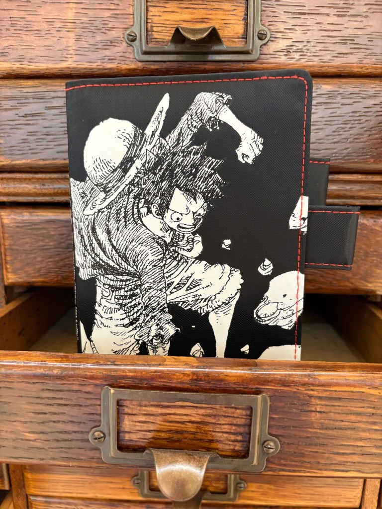
- The black and white One Piece covers this year are pretty great, not as colorful as previous year designs but I think one of my favorites that they’ve done of One Piece. The One Piece HON imo looked better in photos, the colors are just a little dull in person.
- The plaid this year is really pretty in person. I especially love it on the weeks. The faux leather brown pen tabs kind of kill it for me in the A6 and A5, though. But theyre all great fall covers.

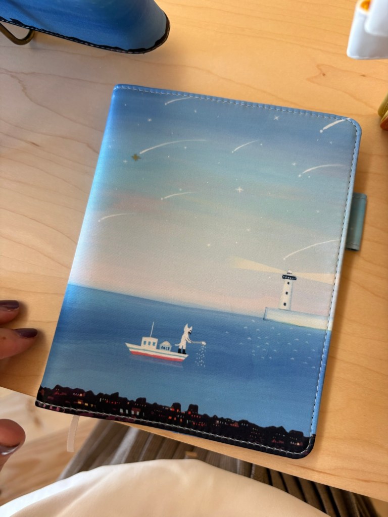
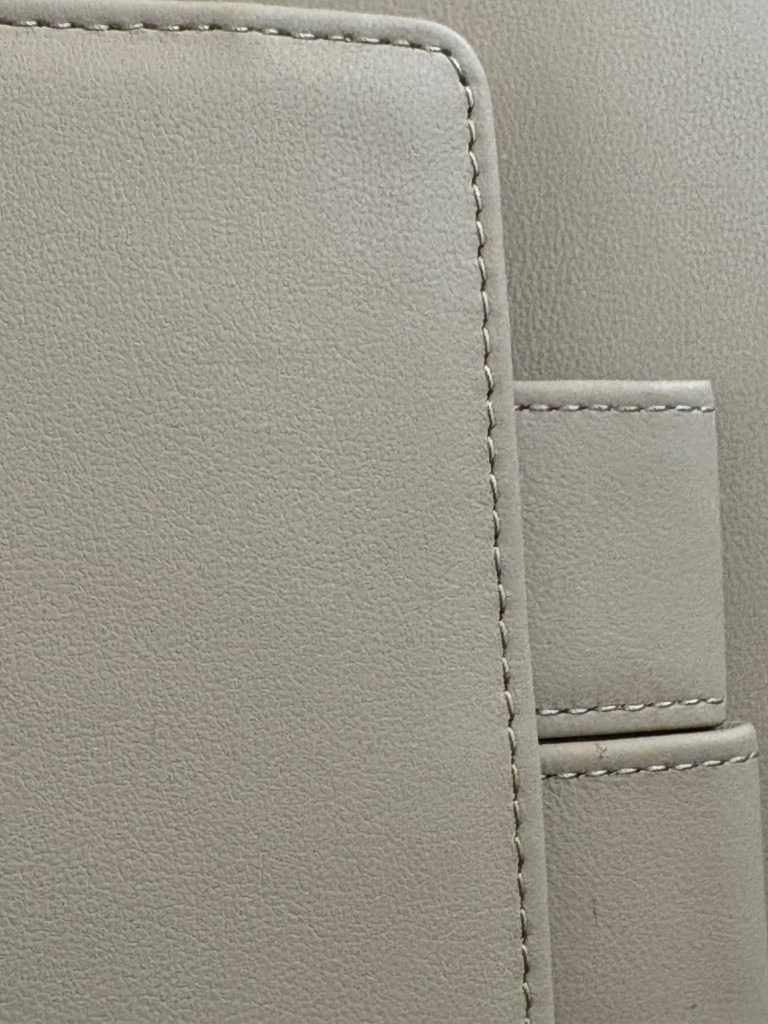
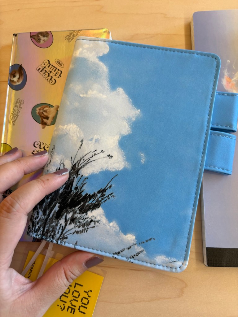
- Ok so speaking of that faux leather. I’m sorry, I hate it so much. I don’t need real or fake leather. I would love it if all covers were just nylon or cotton canvas etc. If they’re going to do leather, real is preferred. Or at least a better faux leather that doesn’t look like plastic that’s going to peel in 3 months. This is what ruined my absolute favorite cover from this year’s lineup, the Field Sky cover. The art is even prettier in person—when they first teased it I didn’t realize it wasn’t a photo. I’m debating if I can get over the interior.

- The calligraphy covers are great, cotton throughout. Lovely placement and usage of pops of color.
- The Little House covers were well done, just not my thing. But the HONs are glossy in a good way.
- The Iyo Okumi covers are very nicely made but due to the embroidery they’re very chunky. Someone I met at the event who was thinking of getting it said it seems very easily snagged, fwiw.
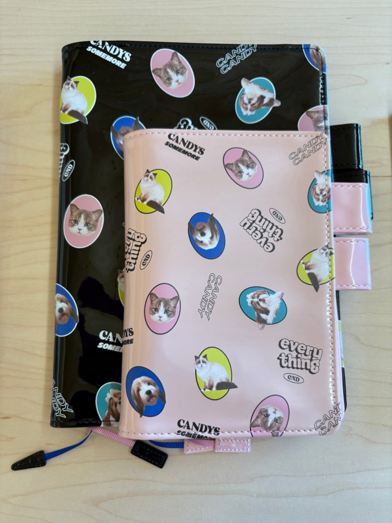
- The Candy Stripper ones are meant to be ridiculous, and they are. I particularly liked the holographic Weeks. But the A5 and A6 covers felt cheap if I’m totally honest. And I’ve bought Candy Stripper covers in the past so I’m not against the aesthetic.
- Makoto Matsubayashi: love love love the glossy dotted Weeks. IMO, very chic. Just enough pattern that fingerprints probably won’t drive you nuts. The covers were cool too, love that shade of pink if you like for your planners to be loud.
- For colors the Airy Flamingo cover is very eye catching, I just love that combo of two tones of the same shade. Every hear i find theres one colors combo I can’t stop thinking about. Last year it was olive grove, this year it’s airy flamingo.
- Tragen is always good. Love that there are more colors. If you’re tempted, do it. I have one and it’s a great functional cover.
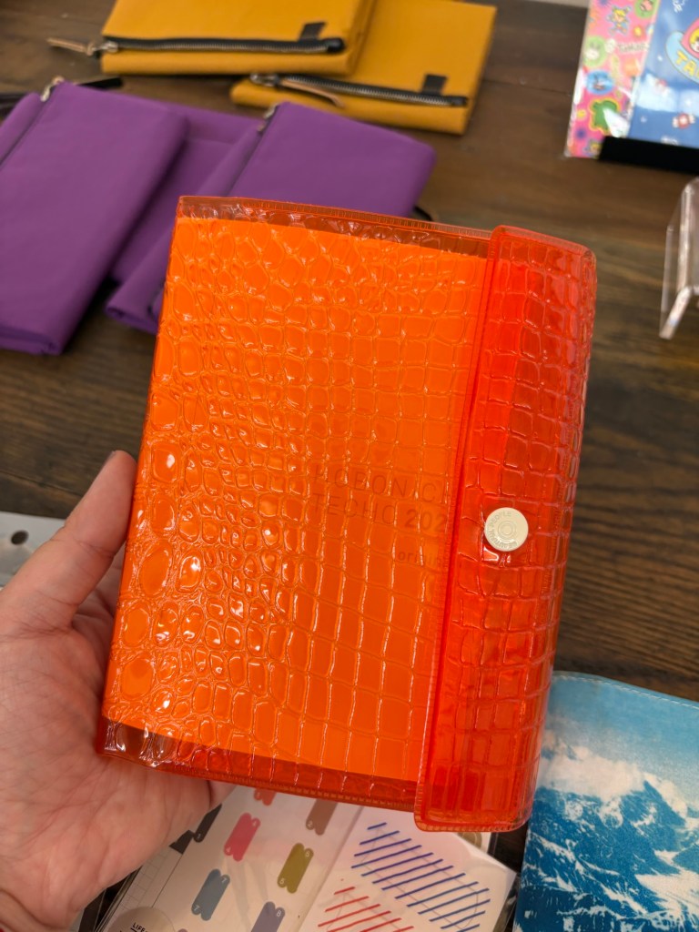
- I love the beautiful people covers. While I hate plastic that pretends to be leather, I love what they did with this plastic; how the yellow of the A6 cover kind of glows through the orange, the pop of color on the inside pocket, etc. I tested them and they are tall enough to take HONs at least on one side if not both (depending on the HON). All that said, it’s very pricey for what it is, imo.
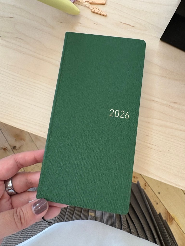
- This year’s green weeks is a very nice medium green shade. It’s a very attractive color, though very strong fall and winter vibes.
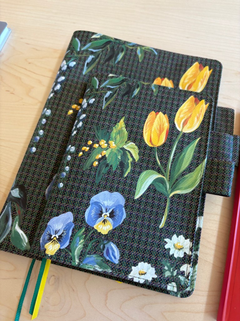
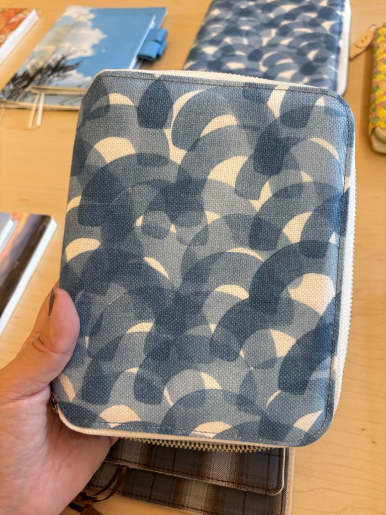
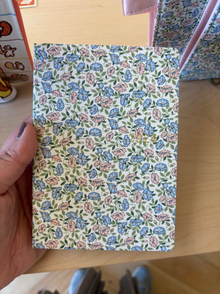
- Liberty Fabrics did not disappoint. For me, a non-floral person, it’s always surprising how much I enjoy the prints in person.
The Yoseka team was lovely as usual, and I met two really fun fellow planner nerds. So great day!
